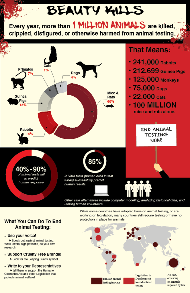
For this venture into data visualization, I created an 11×17” infographic document containing two different types of data visualizations. I began by creating a rhetorical argument to represent the finished document using Logos, Pathos, and Ethos. I chose to focus on animal testing, specifically how animal testing is unnecessary and harmful. After narrowing in on my topic, I came up with mind map and a storyboard in order to create my specific argument and narrow my audience. The document needed to have a defined title, and I chose “Beauty Kills,” because I felt that it was a strong beginning and a good way to grab my audience’s attention.
The final result is a well-organized infographic with attention-grabbing colors that really invoke the feelings of violence inflicted by animal testing. The infographic provides information on the creatures most at risk, the lack of support for the effectiveness of animal testing, and finally, a call to action for those who wish to end animal testing in the realm of cosmetics and personal care products.
